Ekspan Logo & Brand
Identity Guidelines

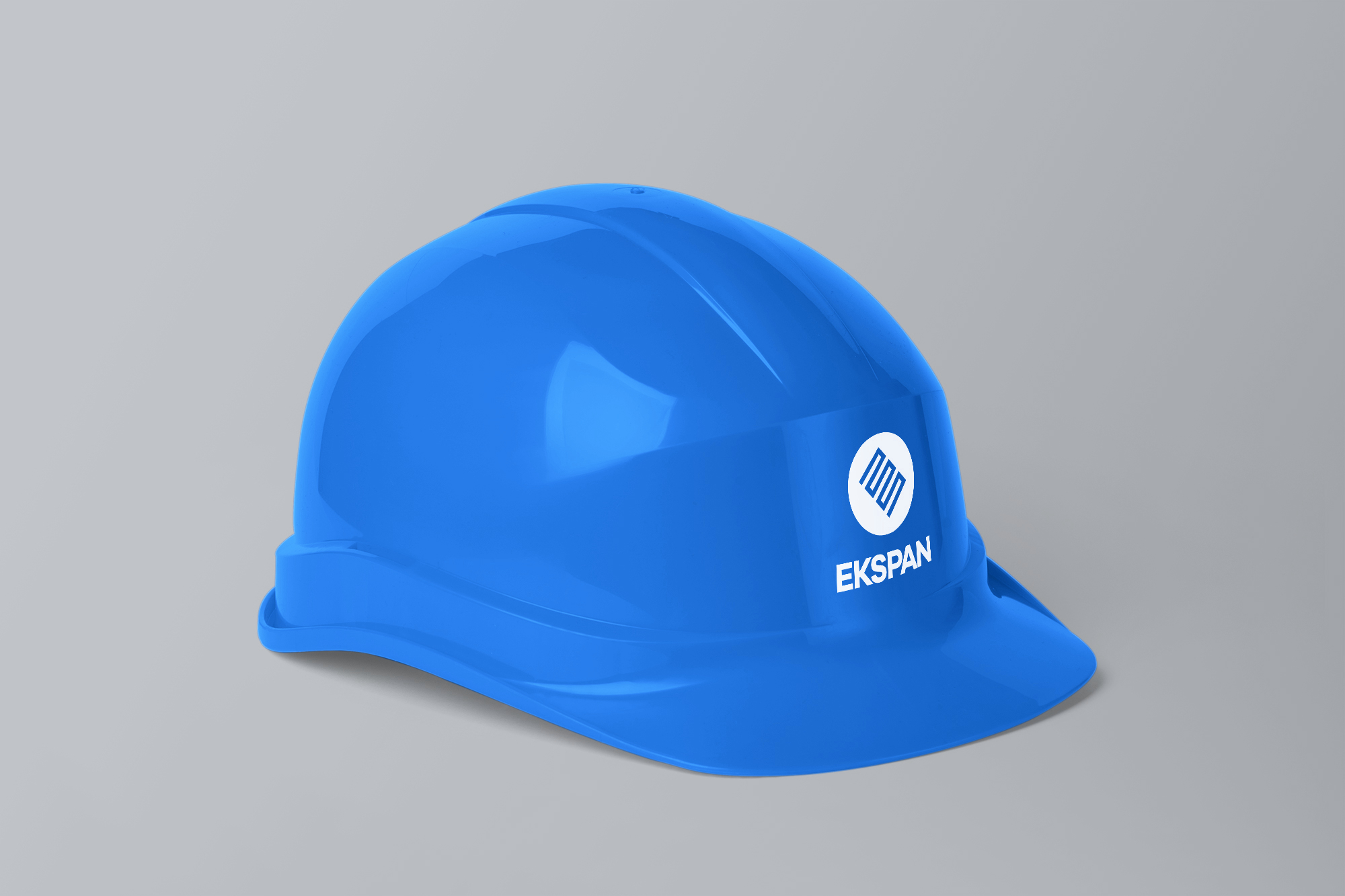
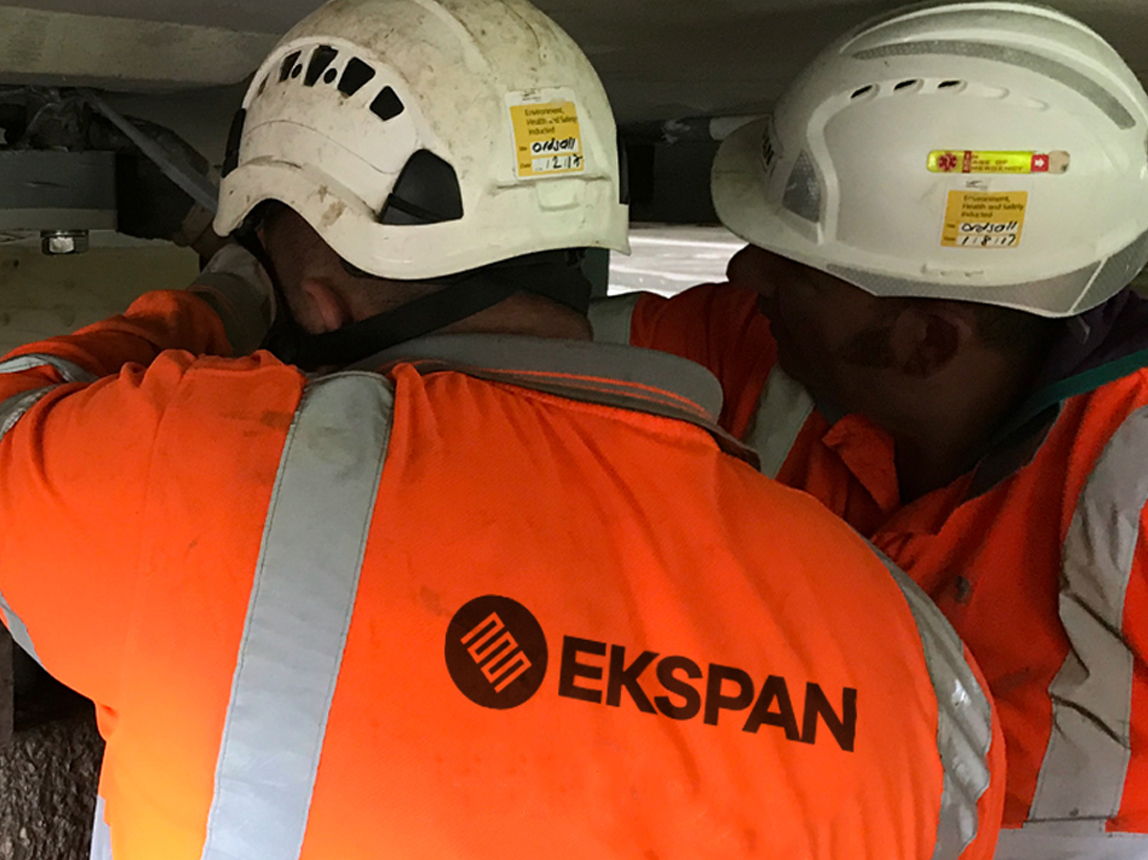
Ekspan are world leaders in the design, manufacture, installation and maintenance of bridge expansion joints and other bridge related components.

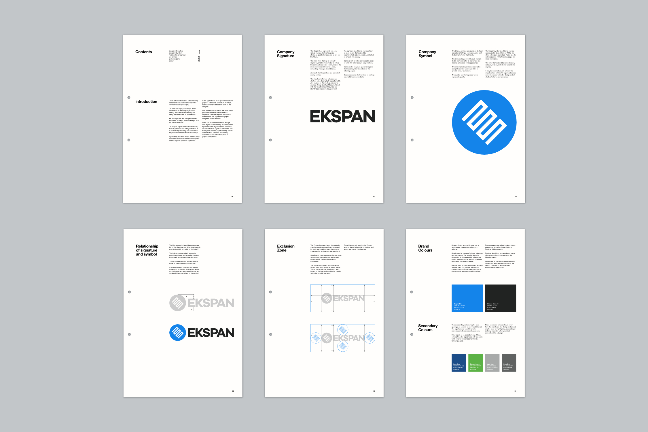
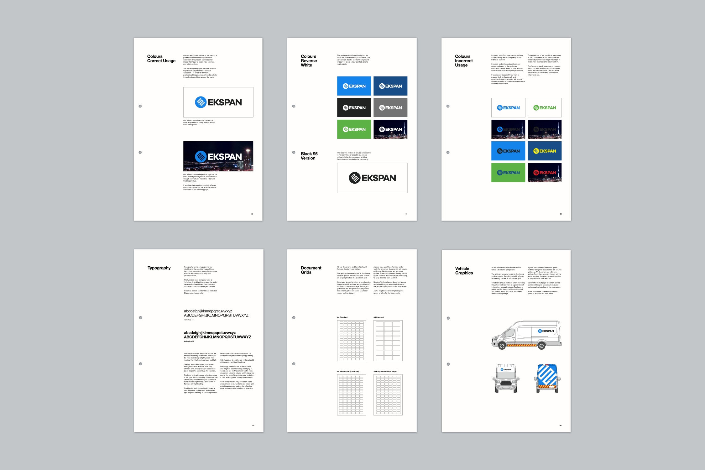
The project comprised of creating a new powerful identity, clear and concise brand guidelines and the application of the identity across many different elements.

The stylised letter E symbol forms the shape of a finger type bridge expansion joint while the encompassing circle represents the complete service they provide.

The contrasting cyan, black and white colour scheme was used to convey strength and confidence in their products and of their service as a whole.

Ekspan Primary Logo
Ekspan Secondary Logo
Ekspan Brand Identity Guidelines Manual
Ekspan Brand Guidelines Pages
Finger Type Bridge Expansion Joint
Ekspan PPE Helmet
Ekspan Van Livery
Ekspan men at work under bridge

What people
are saying

"Stuart is a truly collaborative design professional who guides the creative process with his depth of experience and knowledge of the field. Exhibiting a solid dose of patience, the deliverable was a logo that reflects with clarity the corporate values and sensibilities I had envisioned, a timeless work of art that will serve me for the long haul. For any other design needs, I'll be contacting him straightaway.”

Motet Inc.

“A huge thank you for helping me create the perfect brand, logo, business cards and leaflets for my business. Your professionalism, skill and knowledge made the whole process so easy! It was a pleasure to work with you and I look forward to working together again in the very near future.”

Shanti Sheffield

Let's work
together

If you like what you have seen and think I can help you, drop me a quick message. I don’t offer my contact details directly on this site to help reduce spam, so send a quick message and I’ll get back to you as soon as possible.