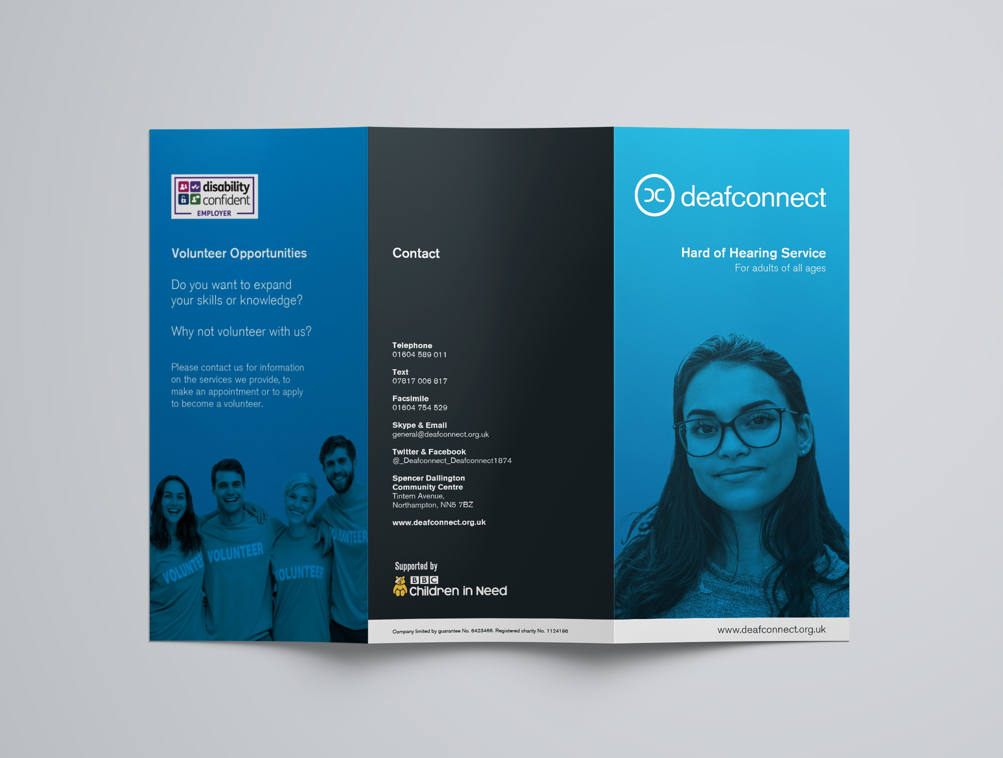
Deafconnect Identity &
Trifold Leaflet Series

Deafconnect are a Northampton based charity aiming to improve the quality of life for Deaf and hard of hearing people by breaking down the barriers they face on a daily basis.

The DC symbol represents two ears coming together i.e. people making a connection; while the circle represents Deafconnect as the entity that has enabled said connection.

The design itself is clear, simple and devoid of distractions and is ultimately timeless in that there is nothing to date the design. Just clean simple typography and an effective, recognisable symbol that is powerful enough to work alone once established in its primary form as shown here.

Deafconnect Primary Logo
Deafconnect Secondary Logo
Deafconnect Hard of Hearing Leaflet Front
Deafconnect Hard of Hearing Leaflet Back

What people
are saying

"Stuart is a truly collaborative design professional who guides the creative process with his depth of experience and knowledge of the field. Exhibiting a solid dose of patience, the deliverable was a logo that reflects with clarity the corporate values and sensibilities I had envisioned, a timeless work of art that will serve me for the long haul. For any other design needs, I'll be contacting him straightaway.”

Motet Inc.

“A huge thank you for helping me create the perfect brand, logo, business cards and leaflets for my business. Your professionalism, skill and knowledge made the whole process so easy! It was a pleasure to work with you and I look forward to working together again in the very near future.”

Shanti Sheffield

Let's work
together

If you like what you have seen and think I can help you, drop me a quick message. I don’t offer my contact details directly on this site to help reduce spam, so send a quick message and I’ll get back to you as soon as possible.